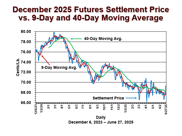
In addition to chart patterns, many traders and analysts graph the moving averages of past price settlements to smooth out the choppy price patterns. Some analysts overlay a slower moving average (say, a 40 day like the green line above) with a faster one (e.g., a 9 day like the red line above) to signal changes in trend that are harder to discern from a choppy bar chart. I am not suggesting that such an indication is either meaningful or a trend, but if traders act on it as such, it may have some short term influence.
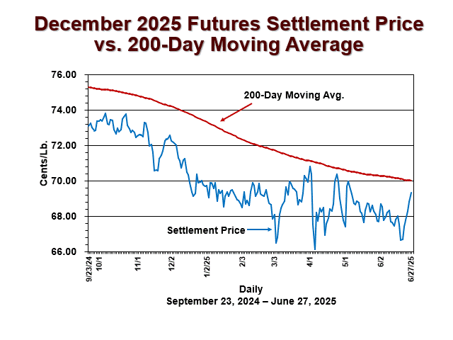
Another approach is looking at a longer term moving average chart like the one below. When futures prices (in blue) cross the 200 day moving average (in red), that is typically noticed and cited by technical analysts as a meaningful price move. As of October 30, 2023, the Dec’23 contract declined sharply enough to penetrate the 200 day moving average from above, which probably triggered more selling from stop orders. Then in January of 2024, the nearby futures contract settled higher than the 200 day moving average, likely triggering buy stop orders. More recently, the most active Jul’24 contract settled below the 200 day moving average on Thursday, April 11, 2024. This could likely lead to further selling, as seen on Friday, April 12, 2024.